My Role
As the primary designer, I played a key role in defining the user experience for the new Billing Orchestration Platform. I guided the design process from research through prototyping, collaborating closely with product and development teams to ensure our vision aligned with both user needs and business objectives.
Key Problems and Context
The project began with a complex challenge: the billing and advisory processes were fragmented and inefficient, with multiple disconnected workflows that burdened advisors and operational teams. The lack of a centralized platform created a disjointed user experience, which hindered advisors from managing tasks effectively and accessing critical insights. The non-existent UI platform resulted in an unfriendly user experience, which increased inefficiency.
Hypothesis
We hypothesized that we could consolidate all billing and advisory tools and processes into a single platform using Appian, a low-code software.
Research:
Validating the Hypothesis
We began the project by analyzing the client’s and business needs, defining a clear vision, and crafting a problem statement. After consulting stakeholders, we chose Appian for its low-code platform, enabling faster development, simplified integration, optimized workflows, adaptability, and secure authentication with Okta.
We defined user roles—directors, advisors, associates, and system administrators—and conducted affinity mapping workshops to identify pain points and goals. This collaborative process aligned the team on user challenges.
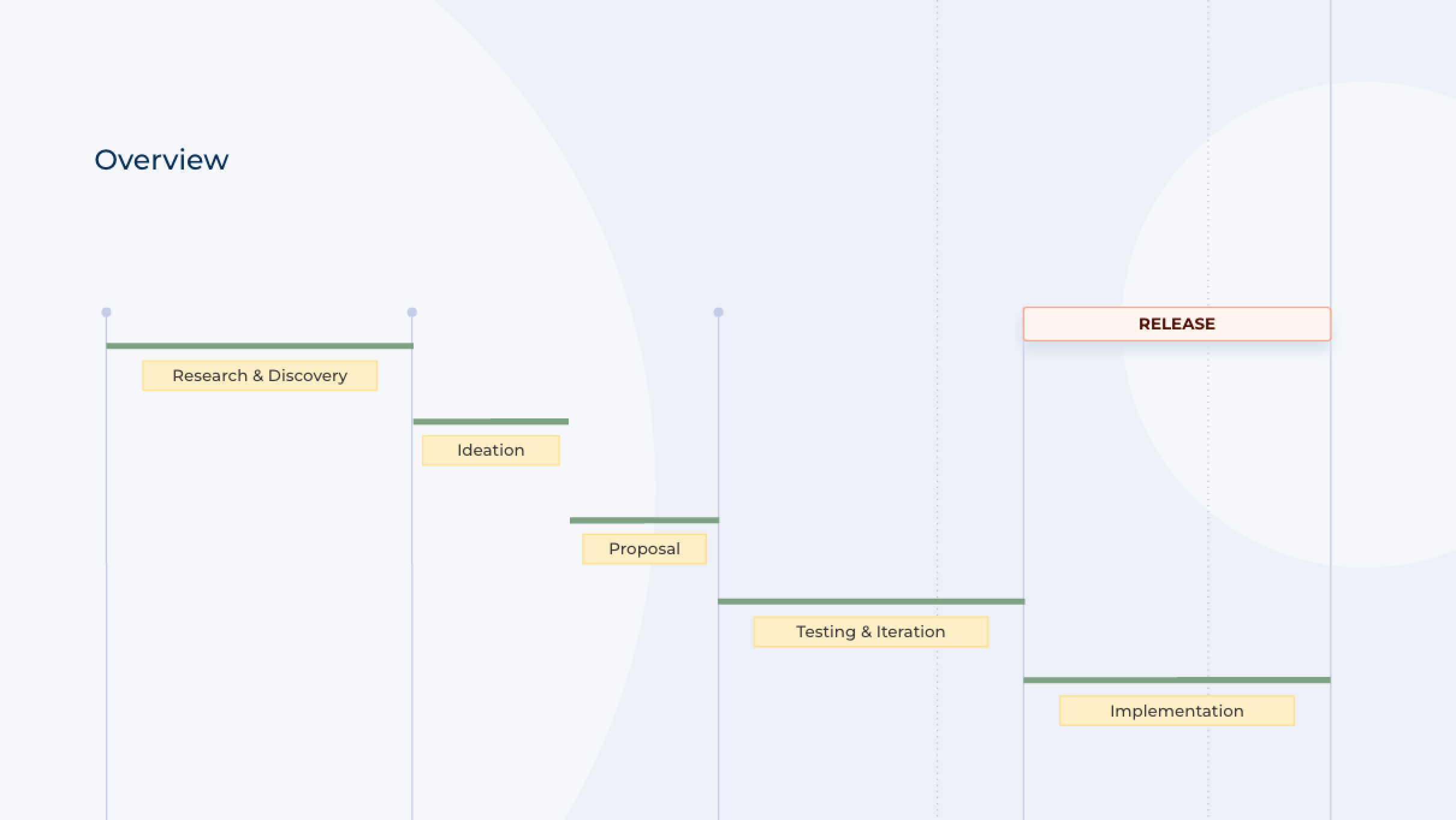
Using design thinking and agile methods (SCRUM), we iterated rapidly with daily client involvement. The double diamond methodology ensured refined designs grounded in real user feedback.
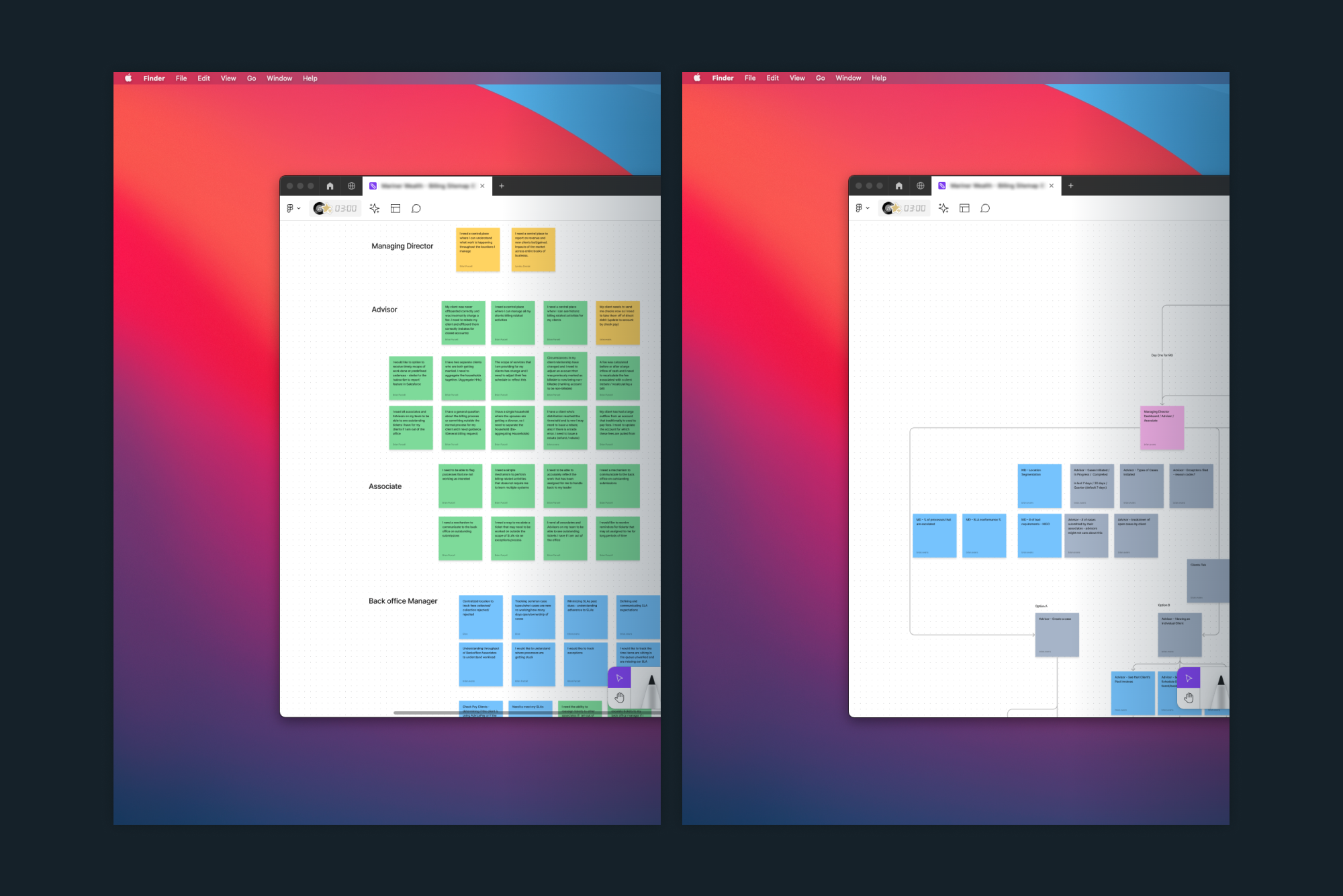
Our discovery process revealed that advisors needed a simple, centralized platform to track cases, manage tasks, and view performance data. We also identified pain points related to task complexity, inefficient navigation, and data overload.
THE DESIGN:
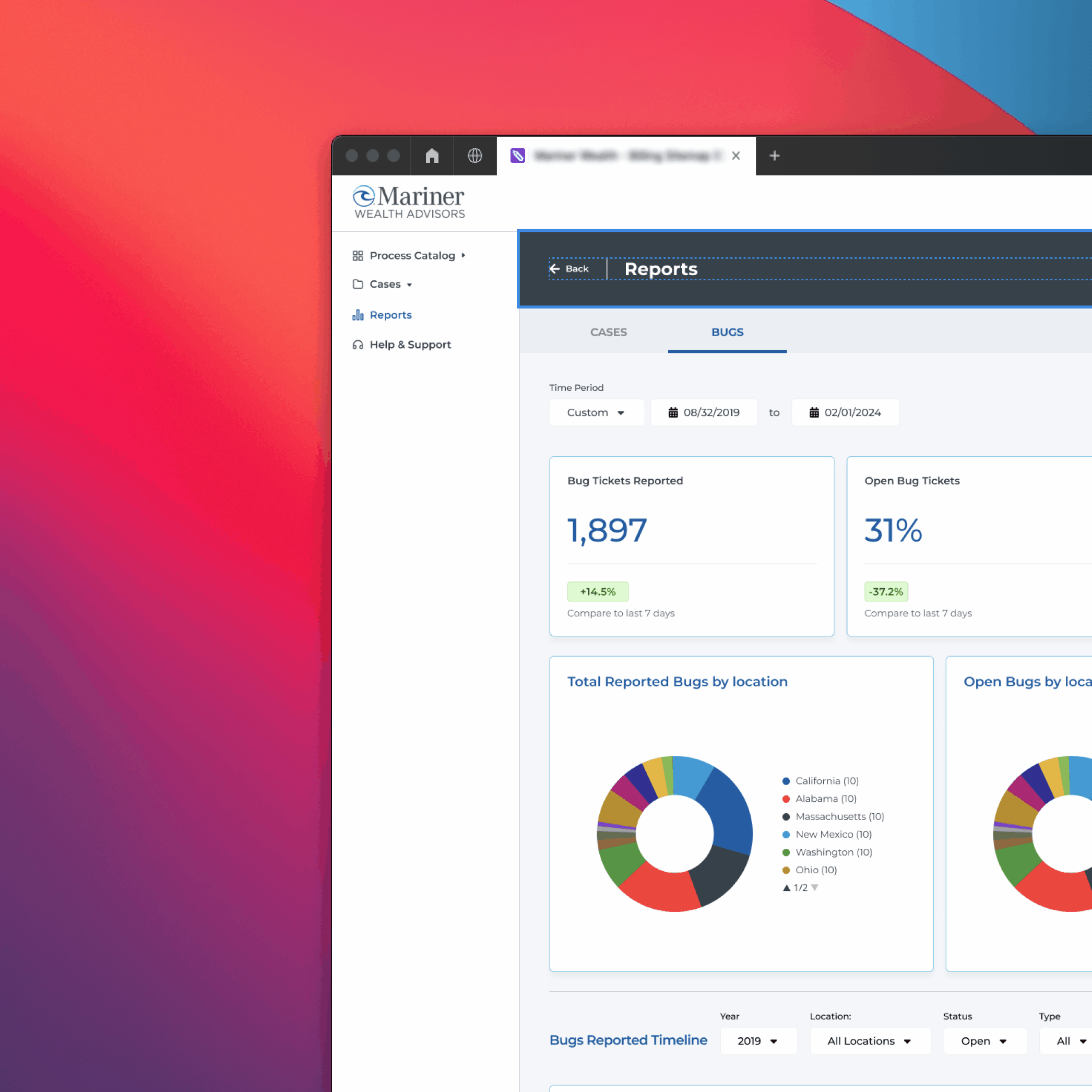
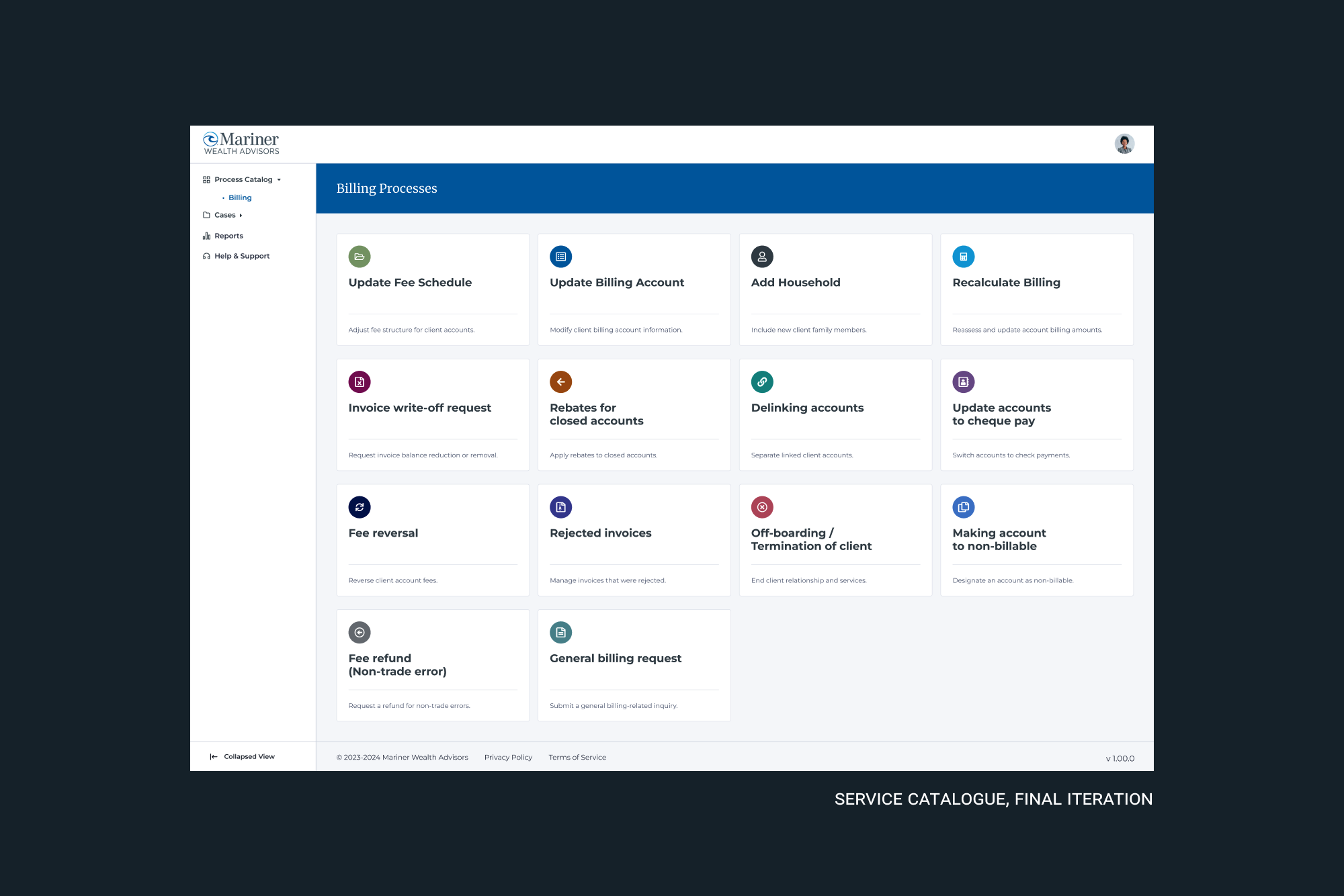
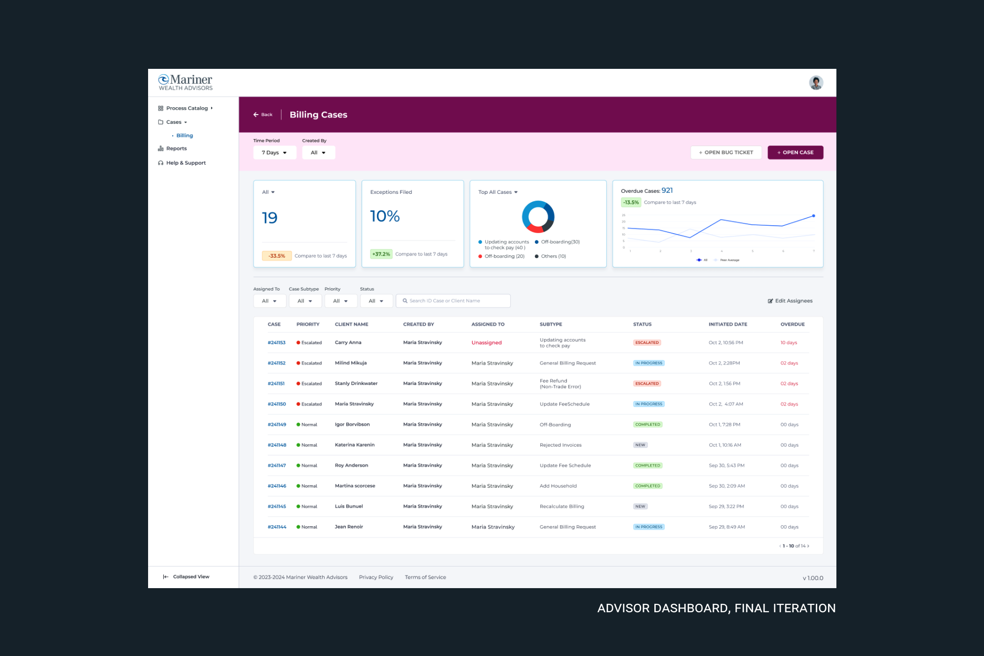
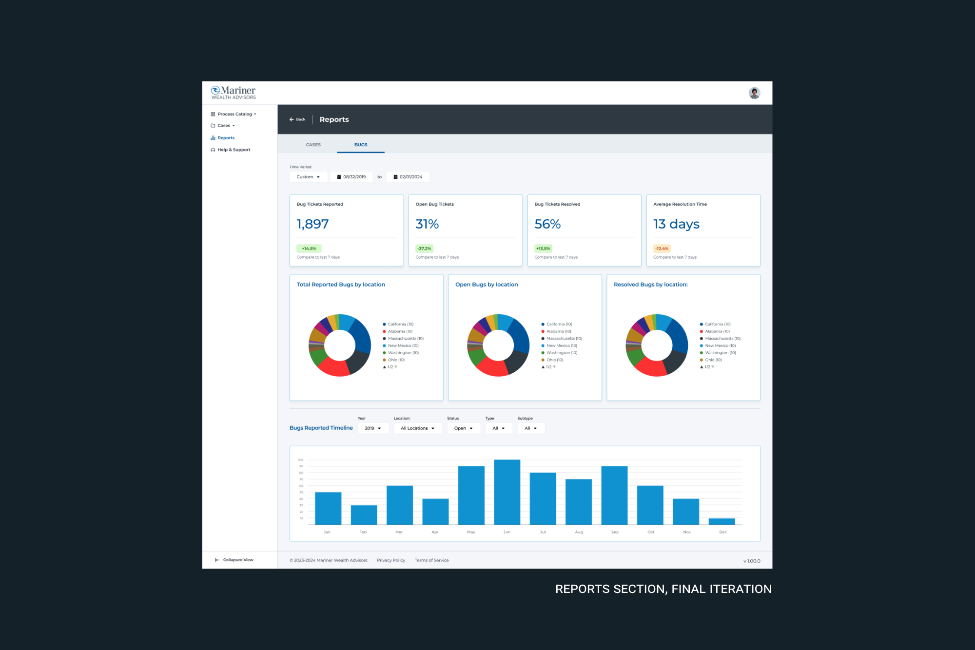
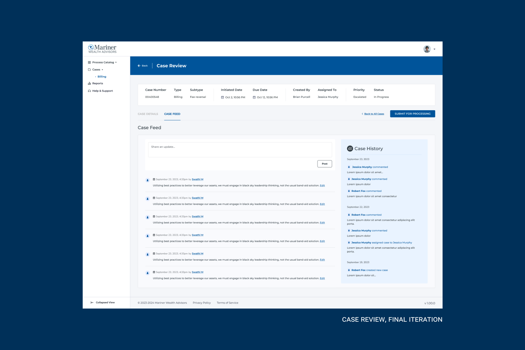
Our design process started with understanding user needs and translating them into actionable features. We focused on simplifying the task flows, centralizing data, and offering tailored insights through dynamic dashboards. Key features included:
- -Performance Summaries:Quick access to metrics
- -Intuitive Navigation:Time-saving, user-friendly menus
- -Task Management:Empowered users for efficiency
We transitioned from wireframes to an interactive prototype using Figma and Appian's guidelines and design system. The interface was designed to be user-friendly, adaptable, and scalable, meeting immediate needs while supporting future growth.
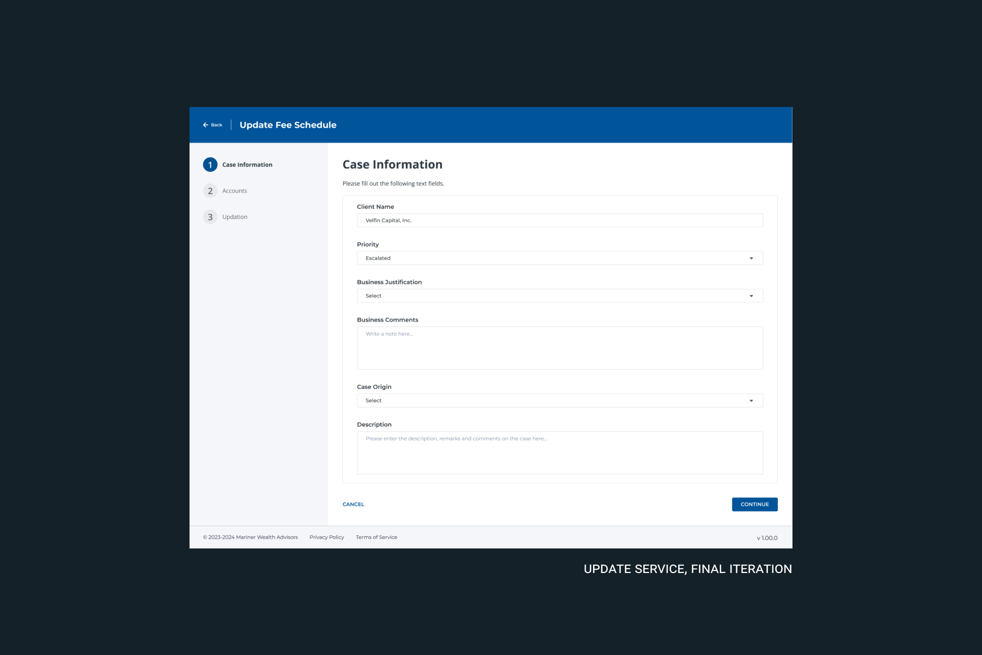
ITERATION
The first iteration involved low-fidelity wireframes, focusing on clarity and user flow. Through testing, we learned that users preferred cleaner, more organized dashboards with real-time data updates and streamlined task management. Feedback led us to refine the UI by: Simplifying hierarchy, improving search and filters and adding visual cues for key tasks.
The final design made critical data more accessible, improving the platform's usability and aligning better with users’ goals.
Key Results
Our design resulted in a clear transformation in the way advisors and operational teams interacted with the platform. Key results included:
- -Streamlined Billing Processes: Consolidated multiple workflows into a single, efficient process.
- -Enhanced User Experience: Advisors reported an easier, faster way to manage their tasks.
- -Operational Efficiency: Automation of manual tasks freed up time for more critical work, enhancing overall productivity.
The final design made critical data more accessible, improving the platform's usability and aligning better with users’ goals.
Want to see more?
Explore Further