My Role
As a UX Designer/Visual Design Lead, I conducted user research, created wireframes, and designed high-fidelity prototypes. I contributed to the project’s strategy, concepts, and sprints, while leading the visual design efforts and ensuring consistency with the current US Bank design system. Collaborating closely with engineers, I ensured the design aligned with business objectives and was informed by research findings, driving the project's success.
Key Problems and Context
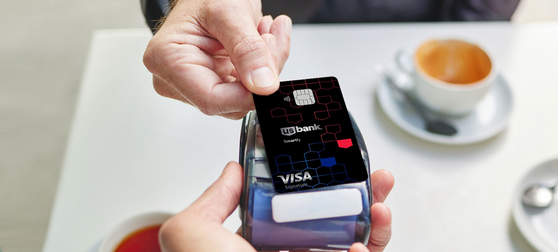
The Text2Apply system had low conversions and weak engagement, as users didn’t feel motivated enough to complete the application. Additionally, bankers lacked an effective communication channel with customers, limiting support and personalization. The goal was to optimize the funnel, enhance the user experience, and deliver benefits for both customers and bankers.

Hypothesis
Our hypothesis was clear: by personalizing the credit card application process and enhancing communication channels for both customers and bankers, we could improve user engagement, increase conversion rates, and create a more efficient support system. This would lead to a seamless experience for applicants and measurable benefits for the bank.
Research:
How Did We Test Our Hypothesis?
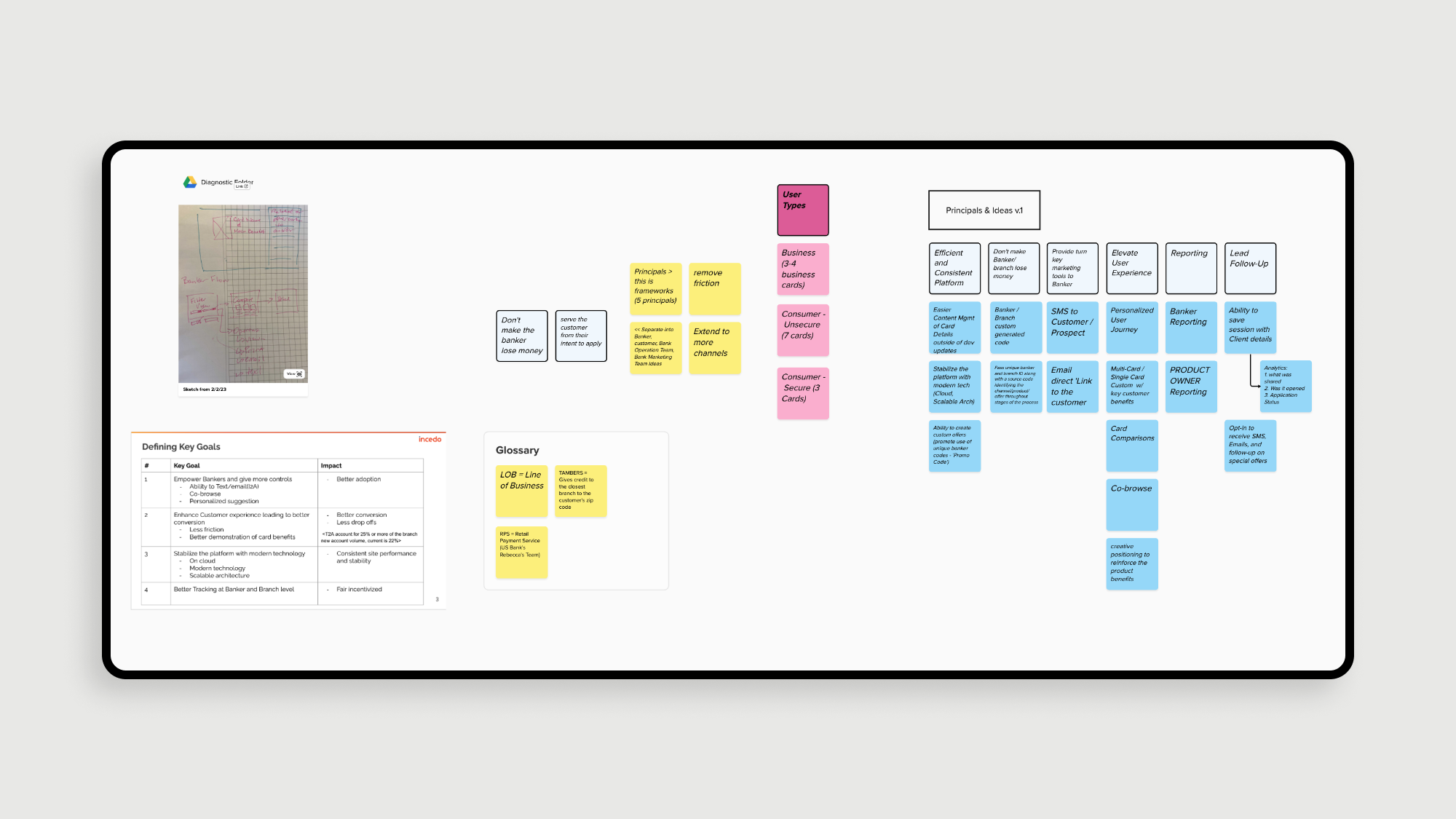
We conducted usability testing with bankers and customers, using interviews, journey mapping, and analytics to track drop-off points. A UX audit, combined with a competitive analysis that included secret shopping visits to competitors, helped us identify best practices to enhance the T2A flow.
Our research revealed that interaction cues in the T2A flow could help users stay more engaged and reduce abandonment.
THE KEY DISCOVERIES:
1. Customers found the transition from text message to application form confusing, often missing key steps due to the lack of visual and interactive cues in the process.
2. Bankers reported that the leads generated through T2A were often incomplete or low quality, making it difficult to convert them into finalized applications.
3. Customers and bankers both expressed frustration with the time it took to receive responses or updates after submitting a request, leading to disengagement and drop-offs.
ITERATION
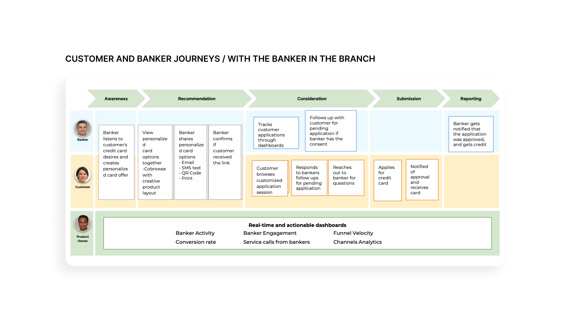
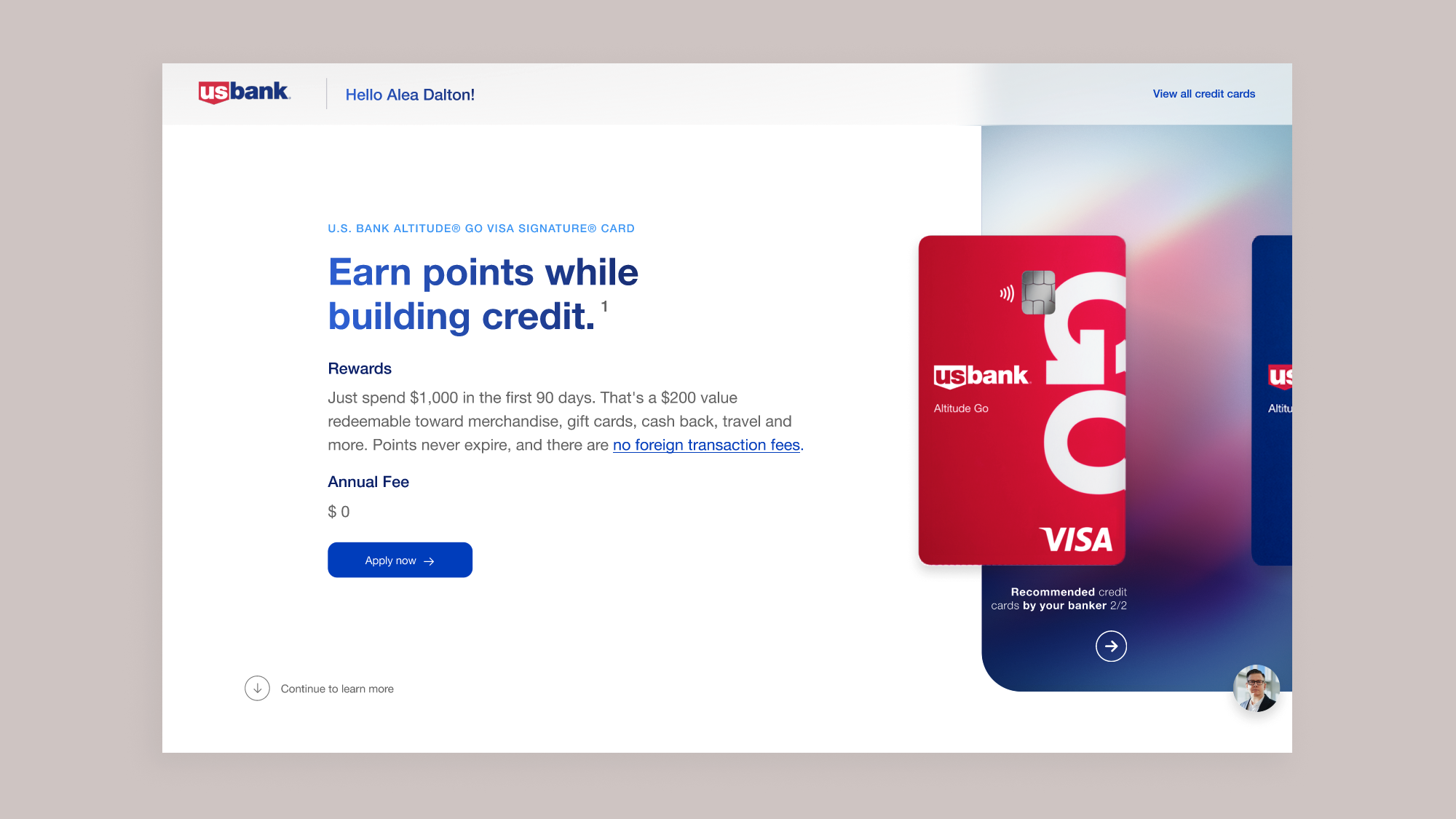
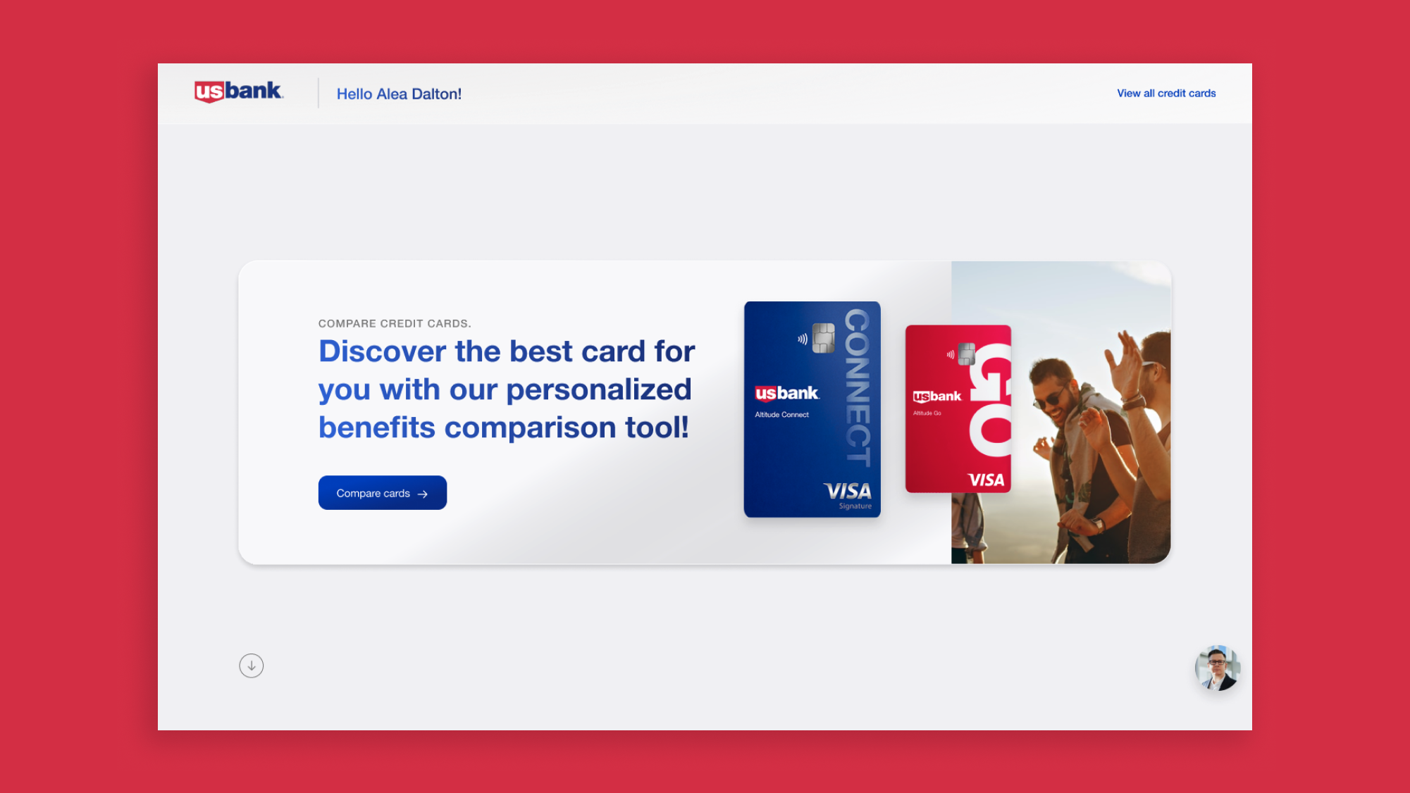
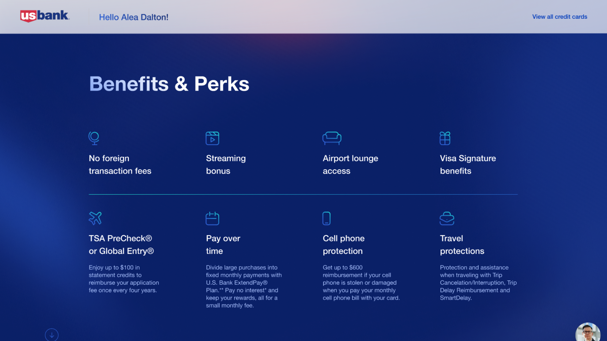
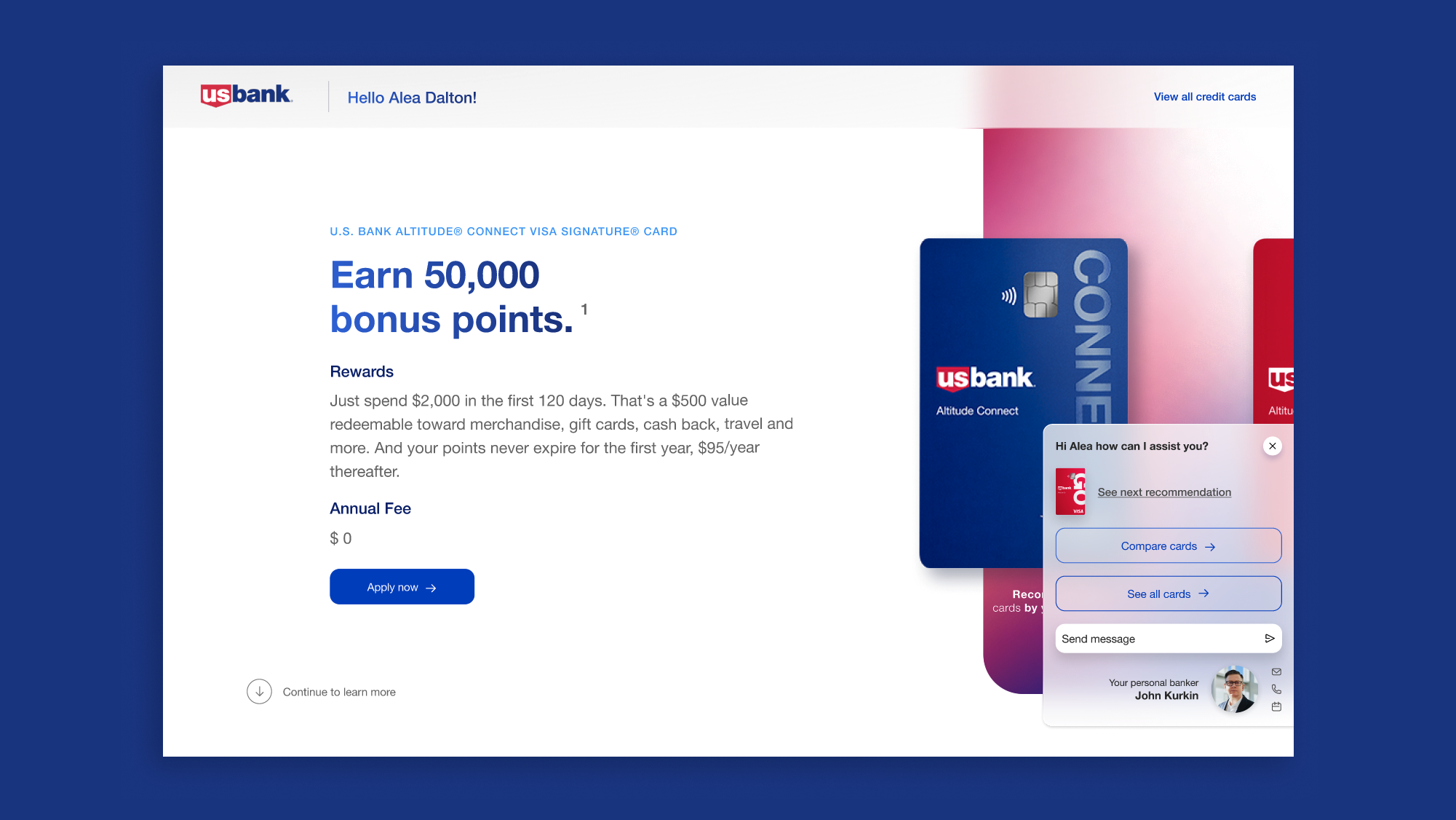
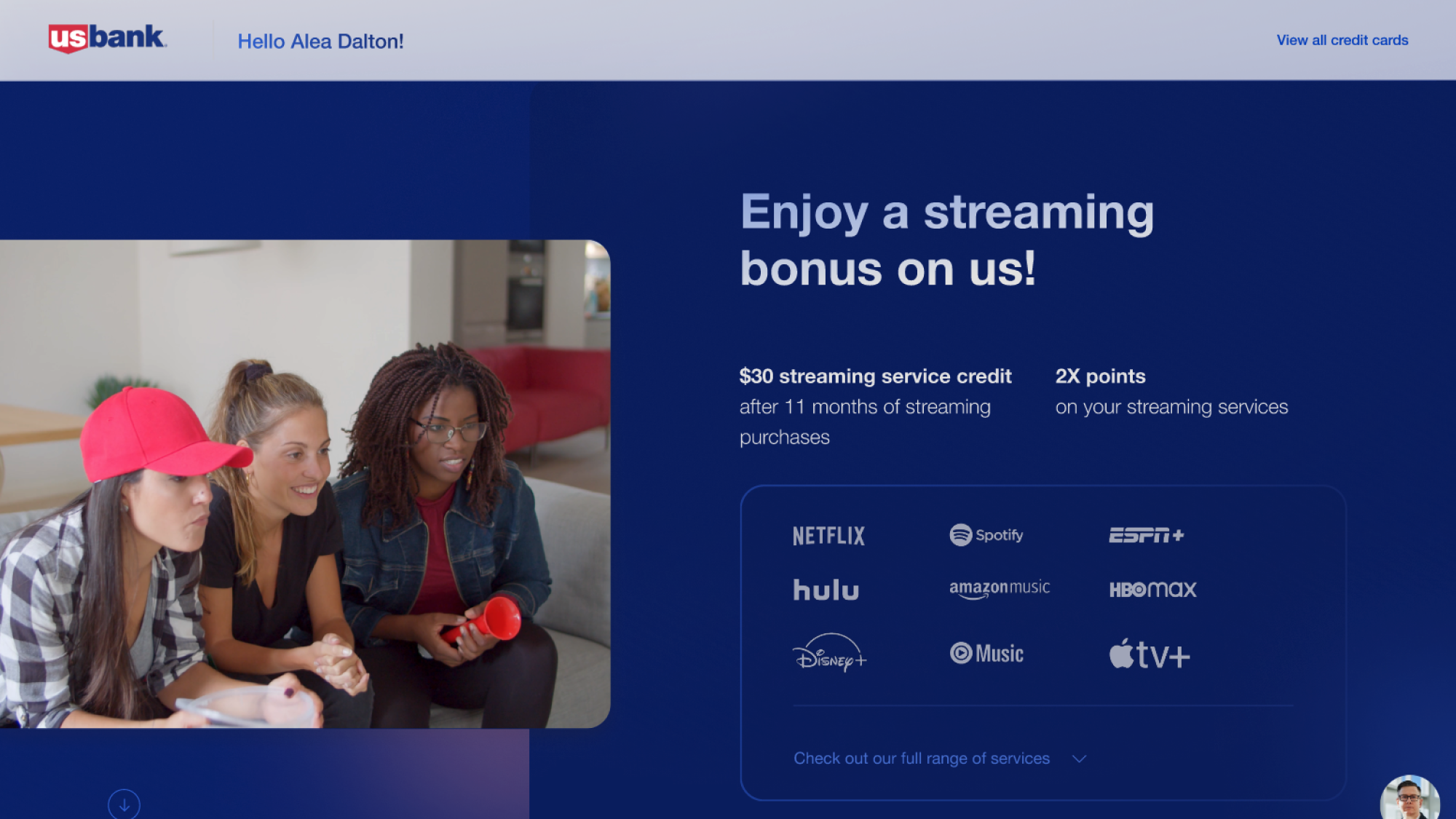
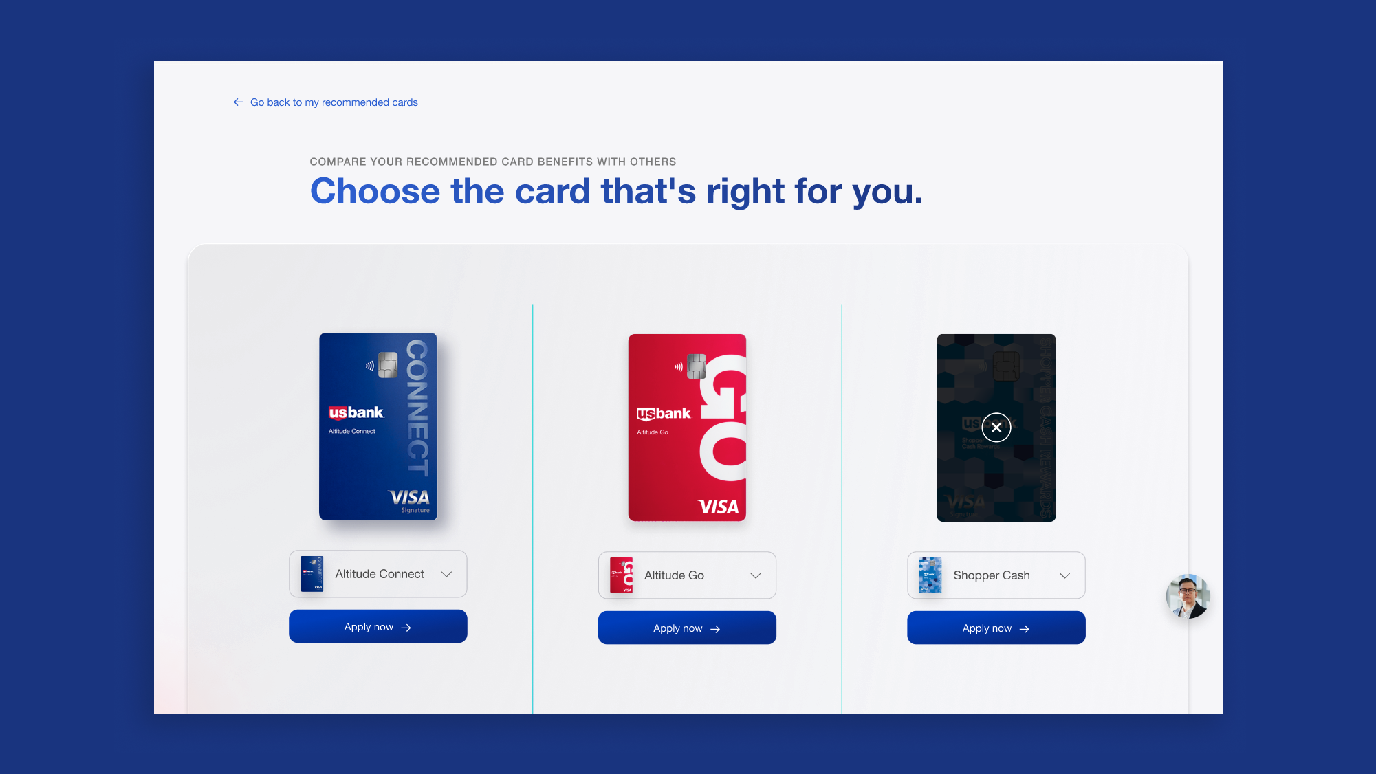
The platform adopted scalable cloud architecture with personalized offers, a comparison tool, and Cobrowse features. Based on research, the UI was simplified, and multi-channel outreach boosted conversions.
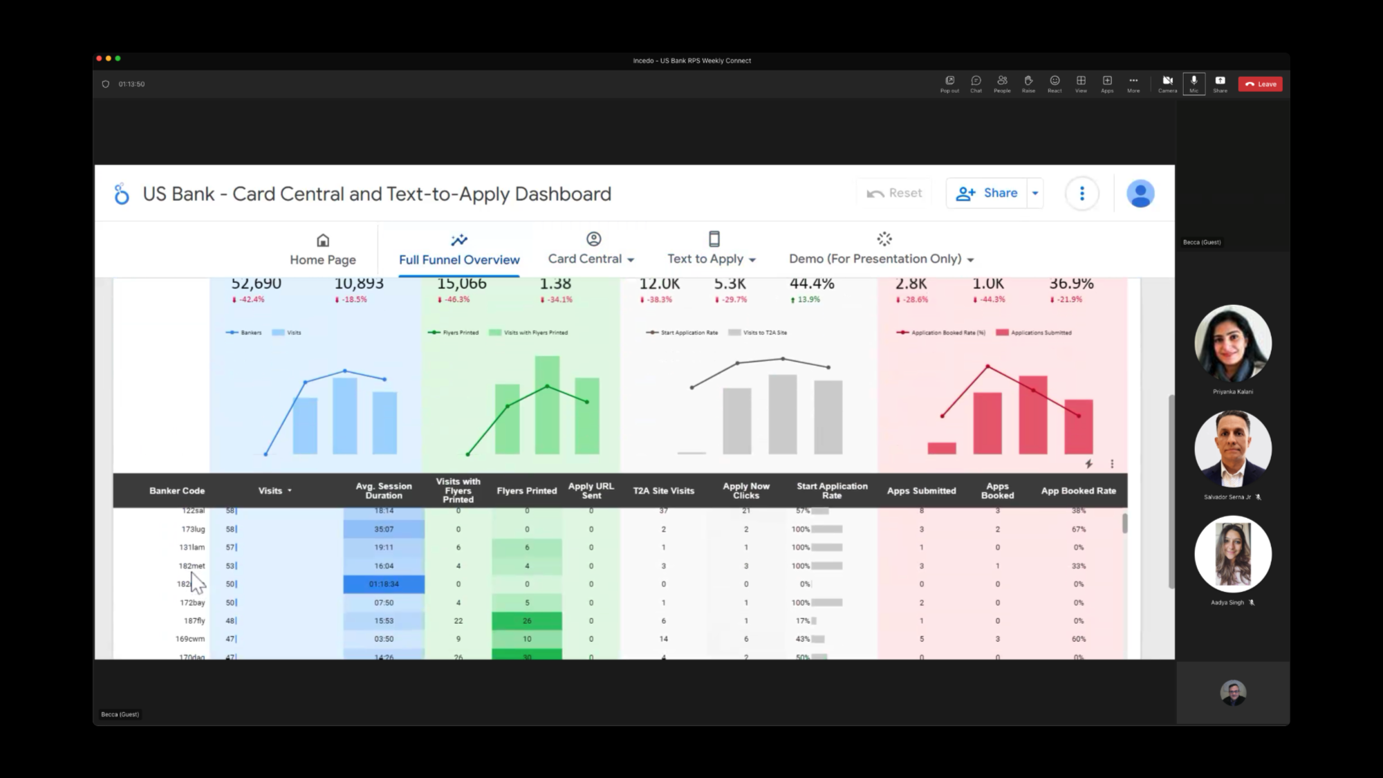
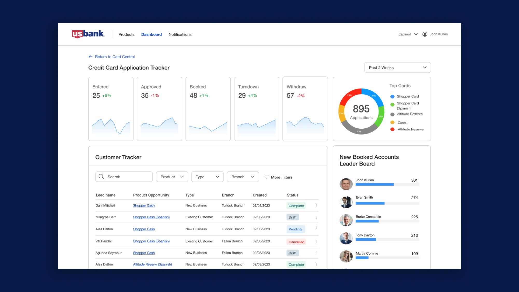
Dashboards provided real-time insights, while self-service features and follow-up automation kept users informed. Communication channels like chat, phone, email, and appointment scheduling improved interactions with bankers, driving conversions.
Outcome & Reflection
- There was a 20% increase in the number of customers completing the T2A application process. The addition of real-time feedback significantly reduced user drop-offs.
- The new dashboards allowed bankers to more effectively target high-quality leads, resulting in a 15% increase in conversion rates.
- Bankers reported a 25% reduction in the time needed to manage T2A leads, thanks to the optimized dashboards and real-time analytics.
This project successfully increased engagement, improved lead quality, and reduced drop-offs by enhancing both customer experience and banker efficiency. It highlights the value of a data-driven, iterative design approach that integrates user feedback and business needs.